
The short answer: there isn’t one single “poorest country” unless you pick the metric first. In the article, Burundi, South Sudan, the Central African Republic, Malawi, and Madagascar keep showing up near the bottom in 2026.
If I look at the numbers in plain terms, here’s what stands out:
- Burundi is the lowest on nominal GDP per capita at $1,030
- South Sudan is the lowest on PPP GDP per capita at $455
- Central African Republic stays near the bottom on almost every measure
- Malawi has a higher income figure than some peers, but poverty is still severe
- Madagascar shows how a country can post a higher GDP per capita while about 69% of people still live in very deep poverty
The big takeaway is simple: income per person, buying power, poverty rates, and HDI do not rank countries the same way. That’s why one list can put Burundi first, while another points to South Sudan.
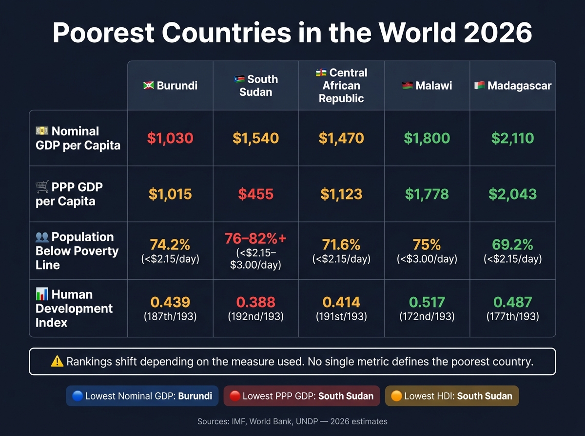
Poorest Countries in the World 2026: Key Metrics Compared
Quick comparison
| Country | Nominal GDP per capita | PPP GDP per capita | Poverty / hardship signal | HDI |
|---|---|---|---|---|
| Burundi | $1,030 | $1,015 | 74.2% below $2.15/day | 0.439 |
| South Sudan | $1,540 | $455 | 76% below $3.00/day; some estimates 82%+ below $2.15/day | 0.388 |
| Central African Republic | $1,470 | $1,123 | 71.6% below $2.15/day | 0.414 |
| Malawi | $1,800 | $1,778 | 75% below $3.00/day | 0.517 |
| Madagascar | $2,110 | $2,043 | 69.2% below $2.15/day | 0.487 |
If you want the cleanest summary, I’d put it this way:
- Use nominal GDP per capita: Burundi looks poorest
- Use PPP: South Sudan looks poorest
- Use broad human hardship: all five belong in the same low-income group, with South Sudan, Burundi, and CAR in the worst shape
So if you’re asking, “What are the poorest countries in the world in 2026?” the best direct answer is: Burundi, South Sudan, Central African Republic, Malawi, and Madagascar – but the order changes based on the measure used.
sbb-itb-39d39a6
1. Burundi
Burundi sits at the bottom of the nominal GDP per capita rankings in 2026, at about $1,030 per person. On a PPP basis, the figure is about $1,015, which puts Burundi second behind South Sudan. That matters because Burundi isn’t struggling on just one measure. It’s under pressure across the board.
GDP per capita
For context, South Sudan’s nominal GDP per capita is about $1,540, Malawi’s is $1,800, and Madagascar’s is $2,110. Burundi trails all three by a clear margin. And even that national average can make things look better than they are, because many households live on far less. In day-to-day life, that gap shows up as hard tradeoffs around food, transport, and basic care.
Poverty rate
About 74.2% of Burundians live on less than $2.15 per day, a share close to South Sudan at 76% and Malawi at 75%. At the same time, inflation is expected to hit 40% in 2025-26, which eats away at the little buying power families still have.
Human development
Burundi’s Human Development Index (HDI) score is 0.439, ranking it 187th out of 193 countries. That puts the country in the lowest tier of human development. Only about 10% of people have electricity, and that shortage affects almost everything, from small shops and farms to schools and medical clinics.
Structural drivers
About 80% of the population depends on subsistence farming, while conflict and weak infrastructure keep output low. Those pressures help explain why income levels, electricity access, and development scores remain so poor. New hydropower projects may help ease the electricity shortage. Still, projected 3.5% GDP growth in 2024-25 is unlikely to change much when inflation is near 40% and extreme poverty is still so common.
South Sudan ranks even lower on PPP, which makes the comparison more revealing.
2. South Sudan
If Burundi comes out lowest on nominal income, South Sudan looks even poorer on a PPP basis. In 2026, South Sudan ranks last in the world for PPP GDP per capita at $455 per person. Its nominal GDP per capita is $1,540, which looks higher at first glance. But PPP shows what people can actually buy inside the country, and that number points to far harsher living conditions. Burundi, for comparison, has a PPP figure of about $1,015 – more than twice South Sudan’s. You can see that gap in daily prices, poverty levels, and access to basic services.
GDP per capita
Inflation is tearing through household budgets. Prices are forecast to rise by nearly 80% in 2025–2026, which means even small incomes lose value fast.
Poverty rate
About 76% of South Sudanese live on less than $3.00 per day. Some estimates put extreme poverty, measured at under $2.15 per day, above 82%.
Human development
South Sudan’s HDI score is 0.388, which places it 192nd out of 193 countries. Electricity also barely extends beyond Juba, leaving much of the country with little or no access.
Structural drivers
A big part of the problem is how narrowly the economy depends on oil. Oil makes up roughly 98% of government revenue, so one disruption can hit the whole country hard. That is exactly what happened in early 2024, when a pipeline rupture in neighboring Sudan, during active conflict, effectively shut down South Sudan’s main export route.
Years of war have made things worse. Civil war since independence in 2011 has wrecked schools, hospitals, and roads, and left millions of people displaced. At the same time, about 80% of the population depends on farming. So when the 2026 Hormuz crisis pushed oil prices above $125 per barrel, fertilizer costs went up and farm output fell, adding even more pressure to food supplies.
3. Central African Republic
The Central African Republic tells a different story from South Sudan. This isn’t mainly an oil story. It’s a story of conflict, weak state reach, and mining income that never turns into broad public gain. Even with diamonds, gold, uranium, and timber, CAR is still the second poorest country by nominal GDP per capita in 2026.
What makes CAR stand out is that it stays near the bottom no matter which measure you use. Not just nominal GDP per capita. On PPP, too, it remains among the poorest countries.
GDP per capita
CAR’s nominal GDP per capita is $1,470 in 2026. Its PPP figure is $1,123, which shows just how weak household buying power still is.
Poverty rate
About 71.6% of the population lives on less than $2.15 per day. On top of that, around 74% of people rely on subsistence farming. That leaves a huge share of households exposed when conflict flares up, harvests fail, or food prices jump.
Human development
The human toll is brutal. CAR’s HDI is 0.414, ranking 191st out of 193. Under-five mortality stands at 116 per 1,000. Maternal mortality reaches 835 per 100,000. And 87.7% of households do not have electricity.
Structural drivers
A big part of the problem is control. Armed groups hold large parts of the country, which scares off investment and disrupts day-to-day economic activity. CAR also has 470 mining sites, but much of that activity is unregulated or illicit. So even when minerals are extracted, the state gets little tax revenue from them.
Geography makes things worse. CAR is landlocked, roads are poor, and fuel and power supplies are unreliable. That makes moving goods, running businesses, and delivering public services harder and more expensive.
"Economic activity had ‘ground to a complete halt’ following major flooding and fuel shortages." – World Bank
Next is Malawi, where poverty is tied less to conflict and more to low productivity, climate shocks, and weak growth.
4. Malawi
Unlike the conflict-driven cases above, Malawi’s poverty is tied more to low output, climate shocks, and the limits that come with being landlocked. In plain terms, many households depend on farming, but farming often doesn’t produce enough income to lift people out of poverty.
GDP per capita
Malawi ranks 6th by nominal GDP per capita in 2026, at $1,800 according to the IMF, with a PPP figure of $1,778. That gap helps explain a tricky point: even with a higher nominal income than Burundi or CAR, Malawi still posts weak poverty and HDI results.
Poverty rate
About 75% of Malawi’s population lives on less than $3.00 per day. More than half of the population lives below Malawi’s national poverty line.
The economy also depends on a narrow set of exports, mainly tobacco, tea, sugar, and coffee. When global prices move the wrong way, household incomes can drop fast. That leaves many families exposed to forces they can’t control.
Human development
Malawi’s HDI score is 0.517, which puts it 172nd out of 193 countries in the UN rankings. It falls into the "low human development" category, pointing to weak results across income, education, and health.
Rural areas face the hardest conditions. Access to health care and schools is weakest there, which makes it harder for people to build better incomes over time.
Structural drivers
Agriculture employs 77% of the labor force and accounts for about 30% of GDP. That’s a huge share of the economy. But there’s a catch: low farm output, weak access to inputs, and too little industry to take in workers leaving agriculture all keep incomes low.
Higher oil prices also push up fertilizer costs, which cuts yields and farm income. On top of that, Malawi faces high transport costs because it is landlocked, unreliable electricity, the 2024 El Niño drought, and debt distress, all of which weigh on growth.
5. Madagascar
Madagascar sits near the bottom on nominal income, but the poverty and HDI numbers point to a much deeper gap in day-to-day life. In 2026, it remains one of the poorest countries in the world.
GDP per capita
The IMF estimates Madagascar’s nominal GDP per capita at $2,110 in 2026, with a PPP figure of $2,043. That’s well above Burundi’s level, but Madagascar still ranks as the 9th lowest country in the world by nominal GDP per capita.
Poverty rate
The income figures only tell part of the story. 69% of the population lives on less than $3.00 per day, and 69.2% live on less than $2.15 per day.
So yes, a country can post a higher GDP per capita and still leave most people struggling. When income is spread this unevenly, the shortfall shows up everywhere people feel it most:
- Health care
- Schooling
- Roads, power, and other basic services
Human development
Madagascar’s HDI score is 0.487, which places it 177th out of 193 countries in the UN rankings.
Structural drivers
A huge share of the country still depends on farming just to get by. About 75% to 80% of the population relies on subsistence agriculture, growing food mainly for their own households with little left to sell. Old farming methods, weak access to fertilizer, and too few factory or service-sector jobs keep output low.
Weather shocks make a hard situation worse. Cyclones, droughts, and flooding often destroy crops and roads. In the south, severe food insecurity has hit many communities, and one major storm can wipe out years of progress.
Madagascar does export vanilla, and it also has mineral and gemstone reserves. But weak roads and poor market access mean those earnings don’t reach most households.
That split between headline income and life on the ground helps explain why the IMF, World Bank, and UN don’t always rank poor countries the same way. Madagascar shows the same pattern seen across this shortlist: income on paper doesn’t always match lived poverty.
How IMF, World Bank, and UN Rankings Differ
IMF, World Bank, and UNDP rankings differ because they track different parts of the story: income, purchasing power, and human development. So when countries land in different spots across these lists, that doesn’t mean the numbers are off. It means each ranking is looking at a different lens.
Here’s what each measure shows, who publishes it, and why the order can shift from one list to another:
| Measure | What It Captures | Why Rankings Change | Source | Use here |
|---|---|---|---|---|
| GDP per Capita (Nominal) | Average economic output per person at market exchange rates. | Fluctuates with exchange rates and commodity prices. | IMF | Comparing the raw size of economies. |
| GDP per Capita (PPP) | Average output adjusted for local cost of living. | Differences in the price of basic goods and services between countries. | IMF / World Bank | Assessing actual purchasing power across borders. |
| Poverty Rate ($3.00/day) | Share of people living on less than $3.00 a day. | High inequality means a country can have higher GDP while most people remain poor. | World Bank | Showing the depth of deprivation on the ground. |
| Human Development Index (HDI) | A composite of life expectancy, education, and income. | Gains in life expectancy or schooling can offset low incomes. | UNDP (UN) | Measuring long-term quality of life and human potential. |
That’s why nominal income, PPP, poverty rates, and HDI can point to different countries as the poorest in 2026. A country may look stronger on paper in income terms but still have deep poverty. Another may post flat income growth yet improve on HDI through better schooling or health. In plain English: HDI adds context to income figures. It doesn’t replace them.
Pros and Cons of Each Poverty Measure
Here’s the simplest way to read the rankings behind these five countries: each measure tells a different part of the story. One shows output. Another shows what money can actually buy. Another shows how many people are living in extreme hardship. And HDI looks at life, school, and income together.
| Measure | Pros | Cons | Best for Comparing |
|---|---|---|---|
| GDP per Capita (Nominal) | Simple; uses market exchange rates. | Understates living standards in low-price economies; ignores cost of living. | Total economic output and market size. |
| GDP per Capita (PPP) | Reflects actual purchasing power. | Based on complex statistical models; slower to update; difficult to collect accurately in conflict zones. | Living standards. |
| Poverty Rate ($3.00/day) | Directly shows the percentage of people facing extreme deprivation. | Depends on household surveys often done every 3 to 5 years; survey years often don’t align across countries. | Finding the most vulnerable people. |
| Human Development Index (HDI) | Multidimensional; includes life expectancy and education. | Less focused on immediate income; can mask deep economic inequality; slow to reflect short-term economic shocks. | Overall human well-being and long-term development. |
Put these measures side by side, and the ranking shifts start to make sense. That’s why the same countries can land in different spots across IMF, World Bank, and UN data.
Poverty rate data adds one more piece. Because it tracks the share of people living below a fixed line – now $3.00 per person per day after the World Bank’s June 2025 update – it can show hardship that GDP averages completely miss.
South Sudan is a clear example. Its nominal GDP per capita is $1,540, but its PPP figure is just $455. That gap is huge. It shows how far nominal GDP and PPP can drift apart when local prices are distorted and conflict scrambles the economy.
HDI is the broadest of the four, but it moves slowly. So while it helps show the bigger picture, it may not pick up short-term economic shocks right away.
Conclusion
Across IMF, World Bank, and UN measures, the same five countries keep showing up near the bottom: Burundi, South Sudan, the Central African Republic, Malawi, and Madagascar. Their exact order changes depending on the metric.
They also share the same broad pattern. Many people rely on subsistence farming. Conflict disrupts daily life and economic activity. Governance is weak, export income often comes from a small set of goods, and climate shocks make a hard situation even harder. These forces feed into each other and slow progress.
That’s why one country can rank one way under one poverty measure and land somewhere else under another. Before labeling any country as the poorest, check the metric, the source, and the year behind the data. A lot of 2026 rankings still lean on older surveys, so IMF, World Bank, and UN results can differ a lot. For 2026, the main question isn’t just which country is poorest. It’s which measure you’re using.
FAQs
Why do poverty rankings change by metric?
Poverty rankings change by metric because no single number tells the whole story. Each measure looks at a different slice of life, so the results don’t always line up.
For example, GDP per capita looks at economic output, often adjusted by PPP to reflect cost of living. HDI goes a step further by adding health and education. Poverty rates, meanwhile, focus on how many people live below set income thresholds.
Which measure best shows real hardship?
No single metric tells the whole story of poverty. GDP per capita (PPP) helps compare living standards across countries, but it doesn’t show what each person earns or what hardship feels like day to day.
A clearer picture comes from looking at HDI alongside poverty headcount ratios. Together, they track life expectancy, education, income, and the share of people living below daily income cutoffs such as $3.00.
Why can GDP per capita look higher while poverty stays severe?
GDP per capita is just an average. That means it can miss a big part of the story: who actually gets the money.
A country might bring in a lot of wealth from oil, minerals, or other resources. But corruption, poor management, or conflict can stop most people from seeing any of that money in their daily lives. On paper, the economy may look stronger. In practice, many families may still struggle.
Growth can also pile up in parts of the economy that don’t create many jobs or do much for the public. So even when GDP goes up, the gains may stay stuck in a small slice of the country. And when population growth moves faster than economic growth, poverty can stay severe even as GDP rises.
